YuTU

Role: UX/UI Designer
Team: 4 designers
Project Duration: 5 Weeks
Deliverables: Competitive analysis, high fidelity mockups, clickable prototype, style guide, usability testing
Redesigning the social marketplace
YuTu Social is a UK social network aimed at bringing together young adults (primarily students aged 17-26 in larger UK city-based universities) in person in their communities and on their university campuses. However, they are struggling to attract consistent users and maintain engagement within the core feature of the app: the marketplace.
We were approached by the CEO of YuTU to strategize:
How can we increase engagement in the social market place feature and allow users to share skills, knowledge, and services at their own price point?
How can we facilitate an environment that builds trust and creates transparency amongst users?
What does the app look like currently?

We took a look at the existing app (specifically the activity feed and marketplace screens) for areas that strengthen the current problem. Here are the takeaways:
The marketplace feature gets lost amongst the busy social media feed
Lack of user engagement in chats
Search function is not robust
What do users think of YuTU?
The first conversation with the client gave us insight into the expansive scope of the redesign of the app. We analyzed a collection of raw user interview responses and a market research study and organized findings through affinity mapping.

View the full Affinity Map here.
Based on the trends in the affinity map we noticed the following:
User profile lacks details that builds trust and reputation - The current app has a “Trust” and “Reach” score in the profile, but user’s don’t understand how to use these scores to judge the trustworthiness of others to meet them offline
Video sharing can be intimidating - Users are unfamiliar with interacting in a social marketplace through video and are skeptical of how the marketplace can be used to successfully list and purchase tutoring services.
Limited Security - The current app does very little to verify that all users on YuTU are students of an accredited university and that all listings in the Marketplace are authentic
Design Strategy
After a thorough app critique, user feedbacks, and drafts of affinity mappings, below represent the concrete directions our client and us decided to take:

Competitive Analysis
From the competitive analysis, we wanted to draw inspiration for user flows, features and visuals. We analyzed Direct and Indirect competitors in the social marketplace space to better understand how they:
Create a seamless shopping experience for users
Integrate a bidding system into purchasing services/things
Encourage communication between sellers and buyers
Direct competitors, Poshmark, Ebay, Facebook Marketplace, Instagram Shopping gave us insight into UI design patterns that we can directly use in the redesign. Indirect Competitors, Patreon, Twitch and Upwork gave us insight into ways that video sharing can build community and gave us ideas for alternative ways to purchase a service.


View the full competitive analysis here.
From the competitive analysis, we compiled a list of 4 main takeaways that can benefit YuTU:
Seller reviews and ratings promote security and confidence for the buyer and builds trust within the app community
Integrate direct messaging between buyer and seller to allow them to address questions live
Organize listings in categories that are easy to digest. Use tags to make products easier to find.
Investigate having different ways of publishing videos: longer live videos vs. short “TikTok” style videos. These flexible features could potentially allow YuTU sellers to better promote their products.
Persona
I created a persona of a university student who would frequently use YuTU and be active in the marketplace. Amy is eager to meet other students who share love of the guitar. She also wants to start a side-hustle by offering guitar lessons.

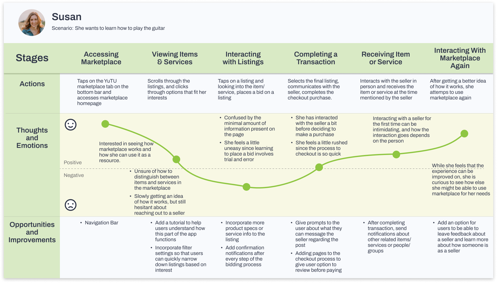
User Journey Mapping
Next, we mapped out Amy’s experience as a seller offering guitar lessons through YuTU and highlighted her actions, thoughts and emotions throughout the process. Then we created a second journey map from the point of view of another student (Susan) interested in buying Amy’s guitar lessons.
Areas of Focus:
Buyer - Confusion on item types in the marketplace, lack of information on how to bid and an unfamiliar check-out process.
Seller - Isn't sure how to share and promote her listing and a lack of information on how to set up her listing correctly for bidding.

Defining the marketplace redesign
We gathered our insights from our competitive analysis, user persona, and user journey maps and began brainstormed feature ideas. Then, we collaborated with the client to arrange features based on user value vs design complexity, and then the top 7 features by order of priority to be designed.

User Flows
After defining the key features of the market place redesign we created user flows representing the actions of a student creating a listing, managing offers for a listing and browsing the marketplace to buy a listing.
Creating a listing - Students can create a listing to sell items or a service
Managing offers for a listing - Students can review offers for a listing and choose the offer to accept and continue the transaction
Buying a listing - Students can browse the marketplace for an item/service they are interested in and place a bid to purchase it.


Prototyping
Once we completed the user flows, it was time to transfer the flows into visible screens and low-fidelity wireframes. Our key focuses for this stage included:
Consistency and organization in clickable routes and features.
Clean, modern visual design that captivates target users.
We continually iterated our design over the span of 2 weeks with 3 major improvements:


Usability Testing
We conducted usability testing with 5 participants virtually with the following goals in mind
Measure the app’s user-friendliness
Measure the ease of using the marketplace feature and success in creating and buying a listing
Assess user satisfaction in navigating the app
Below are the findings for our usability test and critical and major issues that we identified and iterated:


Review the full usability report here
Final Design Solution

Style Guide
We opted for a clean interface design that allowed the pre-set brand colors to pop off the screen without creating eye fatigue for the user. Another request from our stakeholders was to create a style guide that would assist the design team going forward.
Youthful and fresh
Familiar UI patterns with slight customization to fit YuTU’s branding
Designed for iOS with the intention of modifying for Android in the future


Lessons Learned
As this was a growth design opportunity working with a client, these were my major takeaways collaborating in a team:
Communication is key - Always be transparent with your decisions, changes, and strategies, so that everyone is on the same page with the design goals.
Respect differing opinions and ideas - Learn how your teammates think and ask questions to develop more confidence and comfort in collaboration.
Enjoy working outside the comfort zone - Making sacrifices is part of the culture of teamwork. Whether it was dealing with major time differences, constantly iterating, or expediting the project.


