Thrive
UX/UI • Figma • Miro
A mobile app to help people make friends in their local city
Deliverables:
Competitive Analysis • Screener Survey • User Interviews • User Data Synthesis • User Flows • Affinity Mapping • Sketching • Low Fidelity Prototyping • High Fidelity Prototyping • Usability Testing • Style Guides
Role:
UX/UI Designer
Timeline:
3 weeks
Overview
Thrive is a social user experience that helps people meet new friends. This company focuses on helping people who have moved to a new city or town step out and meet new friends in person at events.
Problem
The business team has identified a problem in that the number of people who say they are going to an event is significantly higher than the actual number of people who attend. The company’s location data shows that, no on average, 20% of people who say they’re going actually end up attending the events.
Results
I was the sole UX designer and I led the entire design process from conducting research, ideating, testing creating wireframes, prototypes, and high fidelity mockups for my designs. Since Thrive focuses on private interactions with new friends, it encourages users to commit to attending events and helps them alleviate their social anxiety.
Objectives
• Create a welcoming and safe platform for users to find and attend events
• Keep users accountable and encourage them to attend events
• Allow users to build personal connections and continue engagement off of the app
Research
I began research by analyzing how competitors are designing features to help people find events and foster new friendships at those events. I captured user flows and noted strengths and weaknesses from each competitor.
Competitive Analysis
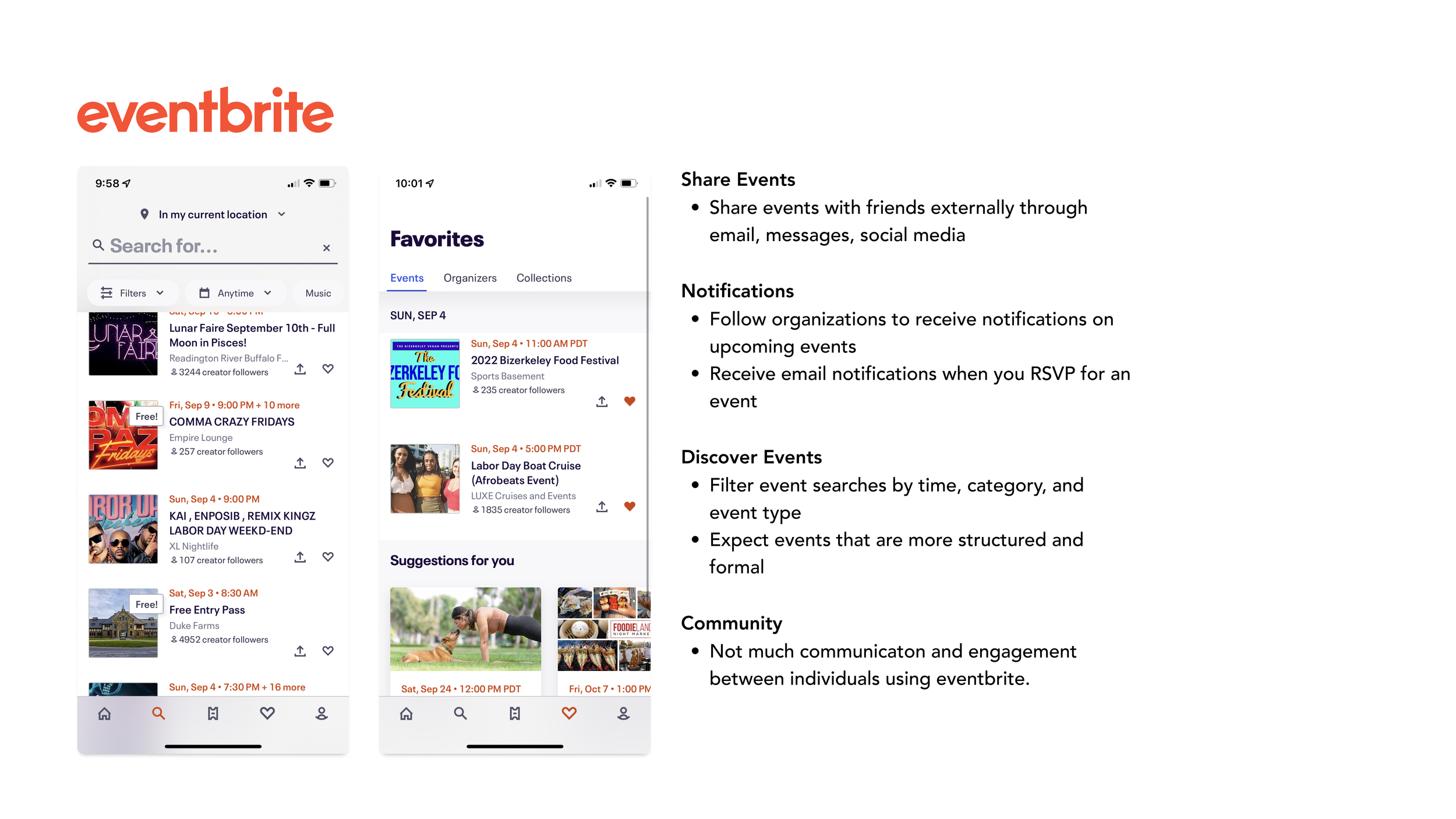


Survey and Interviews
I surveyed 28 people from social media and interviewed 6 people. A few key insights from the user research include:
People are motivated to meet new people because they want to be engaged in a community
Apps like Meetup, Eventbrite and Facebook groups allow people to find others with similar interests and expand their social group
People do not want to go out of their way to meet others because they have their own commitments and are comfortable with their normal schedule.
Some people, find it difficult to meet new people because they are socially anxious and experience a lack in consistent follow ups
People are most concerned about their privacy and safety when using apps to meet other people.
User Personas
With these insights I created 2 personas for different users who would be interested in Thrive:
Irene: Extroverted, adventurous, motivated to stay current with her local community,
Colin: Introverted, conscious of his time and seeks to maintain current friendships, motivate to get out of his comfort zone


Define
Event discovery: How might we optimize the browse and search process so that users efficiently find the information they need?
Community: How might we create an engaged environment that is trusting and brings users to get to know each other and meet?
Event Attendance: How might we keep people accountable to attend events?
Design Principles
Next, I word-mapped and synthesized what I learned from the product brief, user interviews, and competitive analysis to create 3 design principles to guide my design process, align my design decisions to users’ needs and communicate my decisions.
Ideation
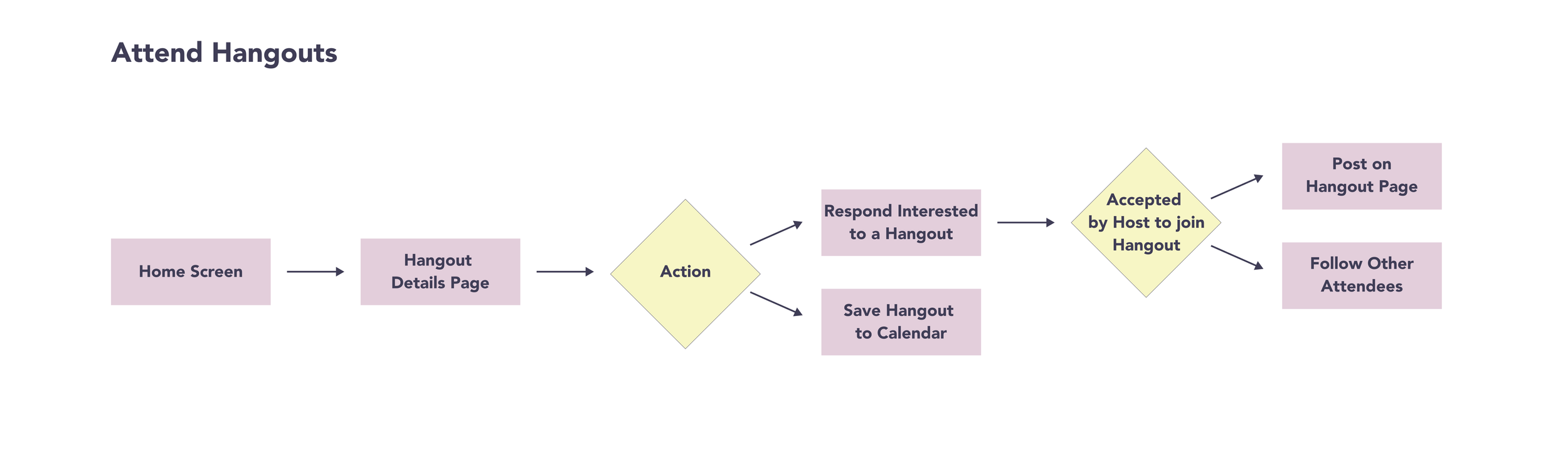
From the discovery phase, I created user flows representing the actions of a hangout host and a hangout attendee.
Sign-In/Sign-Up - This allows users to get a brief introduction of the app before diving into exploring hangouts
Host Hangouts - Host’s create their own hangout and manage attendees interested in attending the hangout
Attend Hangouts - Attendees browse for a desired hangout and decide whether to attend a hangout or save the hangout for consideration later


Prototyping
I created sketches and the mid-fidelity prototypes of the user flows.
UI
After completing my mid-fidelity prototype I began considering the brand’s visual identity.

Usability Testing and Improvements
Based on various feedback from 5 other peers + mentor feedback, I continually iterated my design over the span of 4 weeks and with 3 major improvements:
Final Product

You can also try out the prototype below:
What I Learned
I learned the importance of supporting my design decisions with the needs of users. As a creative individual who is always excited about implementing new ideas, I was challenged to design within the constraints of keeping the user persona in mind. Before diving into a decision, I had to put myself in the shoes of Ally, the user, and ask myself if the decision would benefit users like Irene and Colin.
Also as much as I wanted to think outside of the box and explore creative design solutions to motivate users to join a hangout or interact with others on the app, for certain UI elements it was better to not reinvent the wheel and look for inspiration from existing, familiar UI elements.
Future Considerations
I would conduct further user testing to continually improve upon this product for its niche population of users.
i would like to conduct A/B testing on the hangout check-in feature to see how users interact with it in the calendar vs notification section. With the additional testing I’ll be able to gather insights and data to to help keep users at the focus of the app.